
Prana
Client: DESIGNATION
Role: UX/UI Designer
Timeline: Six Weeks
Deliverables: Research insights, user personas, journey map, wireframes, prototypes
Tools: Axure, InVision, Sketch
Challenge: To design a product aimed to solve a problem in the health and wellness industry. Our team settled on building a meditation and mindfulness education app geared towards busy professionals looking to address their mental health.
THe Challenge
As a three-person team at DESIGNATION we were challenged with examining the current state of the health and wellness industry, identifying a problem and developing a solution. We set out to discover a related problem to answer the question of why people struggle to maintain a healthy lifestyle.
In our initial research, we found that most health-conscious people that we spoke with were interested in addressing their mental well-being, but are not doing anything to address that. We worked together to develop a meditation and mindfulness app that can easily be incorporated into a person’s life so that they can benefit from meditation and mindfulness even if they don’t feel that they have the time to dedicate to them fully.
THe Research
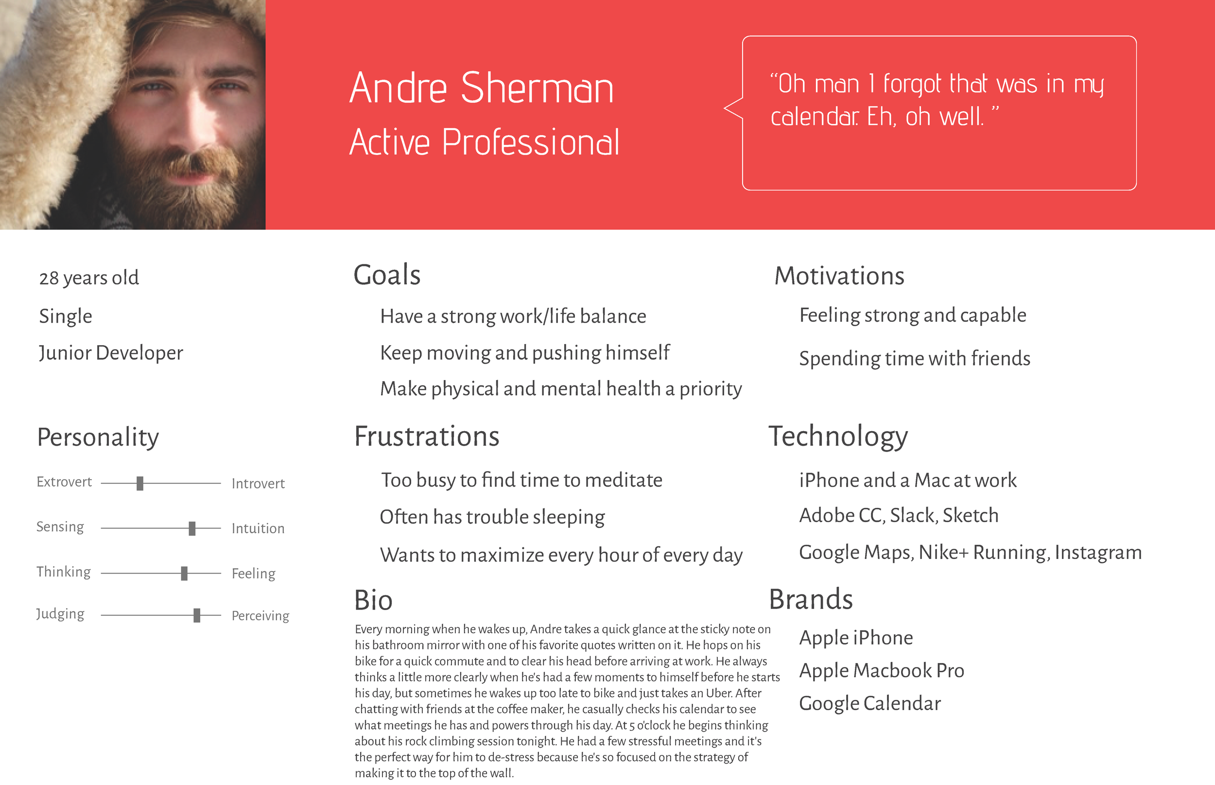
Our team started out with a direction in mind when we began our initial interviews. We were going to gather general health and wellness information from our interview participants and gage whether or not they have participated in health or wellness programs through their employer. We think there is an opportunity to be able to connect insurance companies, employers and their employees to promote health and wellness paired with insurance premium discounts. While our initial research did point to the fact that the people we spoke with were in fact interested in taking advantage of potential health and wellness programs at work, through our affinity mapping of our ten interviews, we noticed other themes that were more prevalent and important to the audience that we spoke with. Our initial interviews pointed to the fact that the majority of the people we spoke with considered themselves to be health-conscious and defined wellness by including both physical and mental health. They are able to address their physical health through eating healthfully and exercising, but the interviewees identified either a lack of time or knowledge as barriers to improving their mental health. With these interviews we developed two user personas to represent our data and a journey map to help us get inside the head of our primary persona.
User Personas
![[DRAFT] Secondary Persona - Grace Manner (1).png](https://images.squarespace-cdn.com/content/v1/574f5725859fd0c51420e9ab/1474901390211-6AGVSXUVEED6O4FY38GR/%5BDRAFT%5D+Secondary+Persona+-+Grace+Manner+%281%29.png)
Customer Journey Map
Our customer journey map shows a day in the life of our primary user persona. It helped us identify his pain points throughout the day and opportunities for our app to help him improve his mood and stress level.
The Approach
After identifying our target users, we began our process by researching current industry trends and learning more about the mediation and mindfulness landscape. We identified our competitors and surveyed the current research about mental wellness. We also conducted an online survey to further gain understanding of where people are with their mental health. Here are some of the results from the 100 respondents:
Competitive Analysis
Building a Design Framework
After looking at our quantitative and qualitative data, we developed a problem statement that we would need to address when designing our app concepts.
Busy professionals need a way to reduce stress and promote mental wellbeing, but have difficulty incorporating mindfulness or meditation into their daily routine.
The insights we gained from our initial research, user personas and competitive analysis helped us to define a list of principles our users could expect from our meditation app.
They are listed below:


As part of the learning process, each team member developed their own concept to design and test with users. I decided focus on the individuals who are interested in their mental well-being, but don’t necessarily know what to do about it. The concept was called Mind Over Mountain and was a meditation and mindfulness education app providing short, easy to digest videos to learn about how to incorporate meditation and mindfulness into the user’s life. The concept also offered the option of messaging with an expert in the area of mindfulness and meditation to encourage further exploration and provide guidance when a user was feeling like they wanted personalized instruction.
The Design


We each tested our concepts with users in both low and mid-fidelity prototypes. In the first round of testing, we used Marvel to digitize our paper prototypes, so that they would still be clickable for the users. We focused on testing usability and I found that users were able to easily able to navigate through the system, however nearly all users were uncertain of the difference between the terms mindfulness and meditation, despite defining them in the onboarding screens.
We then moved to Axure after tweaking our original concepts and building them into a mid-fidelity prototype. With this round of user testing we really wanted to find out which of the three concepts from our team tested the highest and then we would move forward with that concept. Our new users were excited about the gamification that I added into the app. The videos and educational content that the user consumed, the higher they would climb on the “Mountain to Calm”. However, users expressed concerns with the length of the videos, as I did not indicate their length on the videos home screen. Another major concern was the credibility of the meditation and mindfulness experts that they would be able to chat with through the app. When comparing the three concepts from our team, two of them tested high and close together, so we decided to to combine them. My teammate designed a simple breathing meditation app and users appreciated its easy-to-use interface and thought they would incorporate it into their life. Users were also very interested in the educational aspect of my concepts, so we moved forward to combine these concepts.


Convergence
Considering our user testing feedback, our team decided to take the educational portion of my concept and convert it into bite-sized content that would focus on getting the user to understand and incorporate mindfulness into their life. The content is updated every day, which will keep the user engaged and coming back for more. Users would be able to complete mindfulness activities or do a short reading and learn how to stay in the present moment throughout their day.
Our mobile app called Prana, which is Sanskrit for “breath”, combines breathing meditation and daily mindfulness educational content into one easy-to-use interface. Our next step was for each of us to design an interface that we would test with users to see what resonated with them the most. In beginning my creative design process, I started with a brief survey of our competitors to compare their general layouts and color schemes. I then created a style tile that reflects the colors of a mellow evening sky, which emulates a calm, simple and natural interface. I utilized Sketch to design my high-fidelity screens and went through many versions following UI critiques from industry experts.
Style Tile
For the home screen I wanted a simple interface. We chose to design for the Android platform, so I was utilizing Material Design’s card format for my home navigation. The user can either go right to the breathing meditation, check on the mindfulness activity for the day or look at their stats and customization options. I really enjoyed learning how to animate the the shape that the user will match their breath with. I used a gif plug-in within Sketch. In designing the cards for the mindfulness information section, I designed a light-feeling card through having a light background and adding clouds in the corner of the card. I used white line icons to communicate the section that the user was in and to help with the instructional onboarding.


After each team member had Prana designed, we conducted a round of user tests to find out what was working and which aspects were resonating with the concept of mindfulness and meditation. What we found was that our designs all tested very closely, but there were stand-out features from each app.
Concept A: Navigation
Users identified this concept as the easiest to navigate.
Concept B: Card Presentation
Users enjoyed the functionality of the cards.
Concept C: Color Palette
This calm color palette tested the best for all users.
Moving forward we decided to combine those aspects and features into our final User Interface for Prana. Users really liked the lightness of my card format of the learning portion of the app, but preferred the navigation structure and color palate of my teammate’s designs. We were able to successfully apply each of these items into the same app. However, one of our biggest challenges was getting the app to express and promote meditation and calm, while still being clear with our directions and presentation of content so that the user felt totally in control of their meditation and learning. We accomplished this through the use of icons and allowing the user to customize the shapes and color.
VIEW OUR FULL PROTOTYPE BY CLICKING ON THE IMAGE BELOW:

What I learned

This was my first design project as a UX/UI designer. I learned the value of working within agile methodologies for successful project management and saw it push our creativity further than we could have ever expected. I also learned that the more extensive and thorough our research, the stronger our design framework was, which helped us created the most effective end product. Strong communication and a willingness to learn from my teammate’s strengths proved to be an invaluable approach to solving our product’s design problems. While working on Prana I quickly realized that I made the right decision to start a new career in user experience design!